Find a striking style prompt, copy it as is, and the first couple of images look great. The trouble is that the more people paste the same sentence, the more their results resemble one another. For anyone who wants the look to belong to a brand or a channel, that resemblance is a weakness, which makes the step after the one-line style sentence the real work.
This article records that next step as a test. We ran one risograph-style sentence on three different subjects, separated what held across all three from what changed from image to image, pinned the changing parts down in words, added one recurring element of our own, and generated again. Every prompt below is exactly what we entered.
Where the idea came from and what this covers
The caption of ohneis652's carousel post points out that copying a riso style prompt tends to give everyone the same pink frame and orange halftone. It advises running the prompt on your own product, a person or a room, and keeping only the colors, paper texture and line weight that show up every time. It then suggests adding something only the brand has, such as a logo shape or a recurring character, putting the logo and real copy on top, and writing everything down on one page.
We used only the order of work described in that caption. We did not receive that post's prompt material and did not copy it here. The style sentence, the test subjects, the style sheet format and the recurring element below are all new. We did not use the original author's carousel images or style composition, and nothing here tells you what their actual prompt looks like.
The first test: one sentence, three subjects
First we wrote a typical style sentence. It names two inks, halftone, print misregistration and paper texture, and only the subject changes: one product, one scene with a person, one building. The exact input for the first subject is below, and the other two differ only in the last sentence.
Two-ink risograph print look: only teal blue and warm orange-red inks on off-white uncoated paper, visible halftone dot shading, slight misregistration between the two ink layers, rough paper grain, flat shapes with thick uneven outlines, generous empty margin, no gradients, no text. Subject: a ceramic coffee mug with steam on a small wooden stool.
The other two subjects were "a woman reading a book in an armchair beside a tall plant" and "a small bakery storefront with an awning and a bicycle parked outside". We generated each image once, with no picking and no reruns.
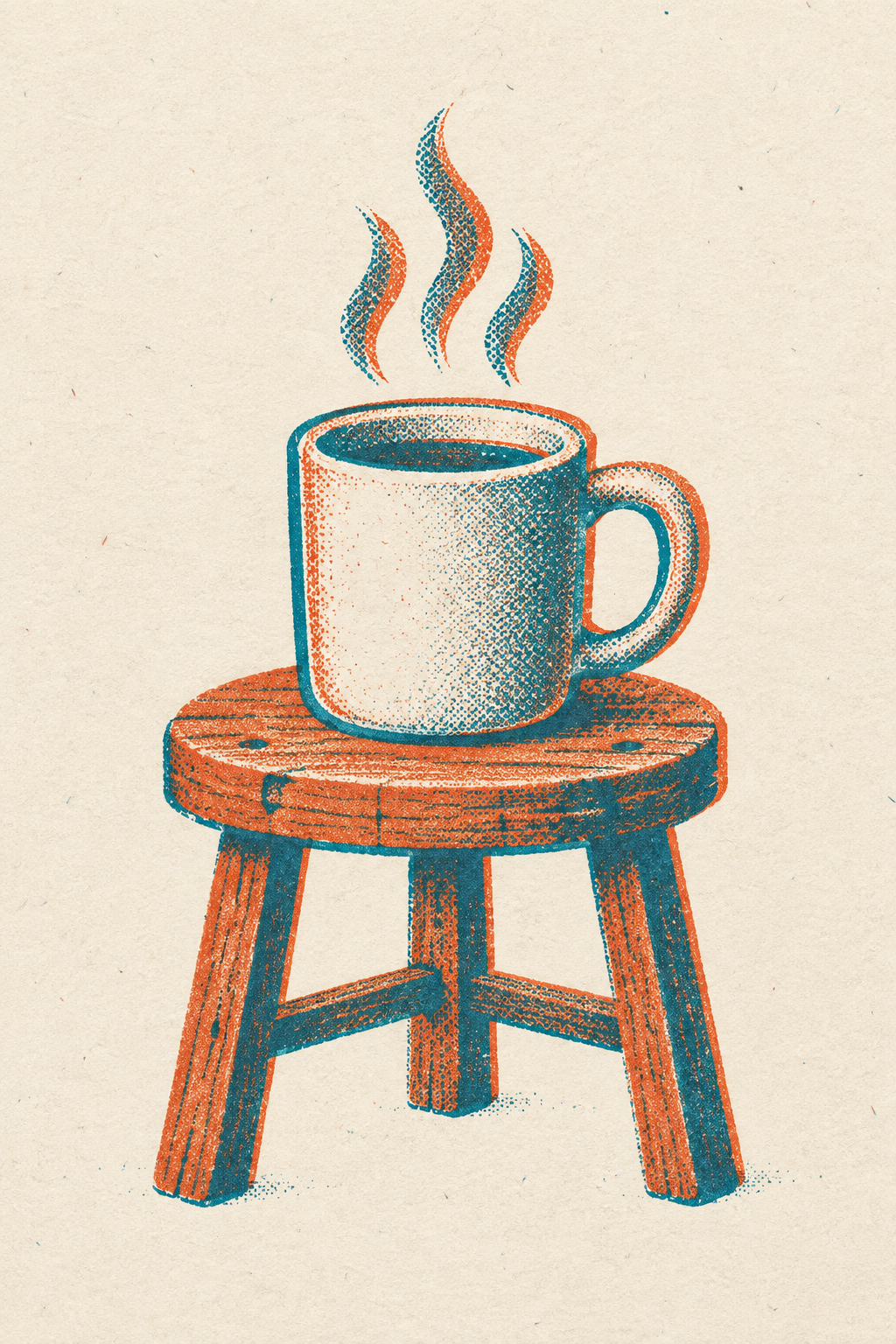 First test result: a mug on a wooden stool in teal and orange inkView original
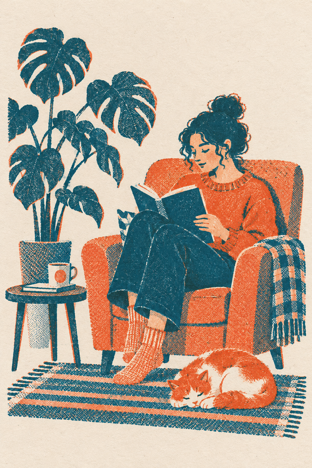 First test result: a person reading in an armchair from the same sentenceView original
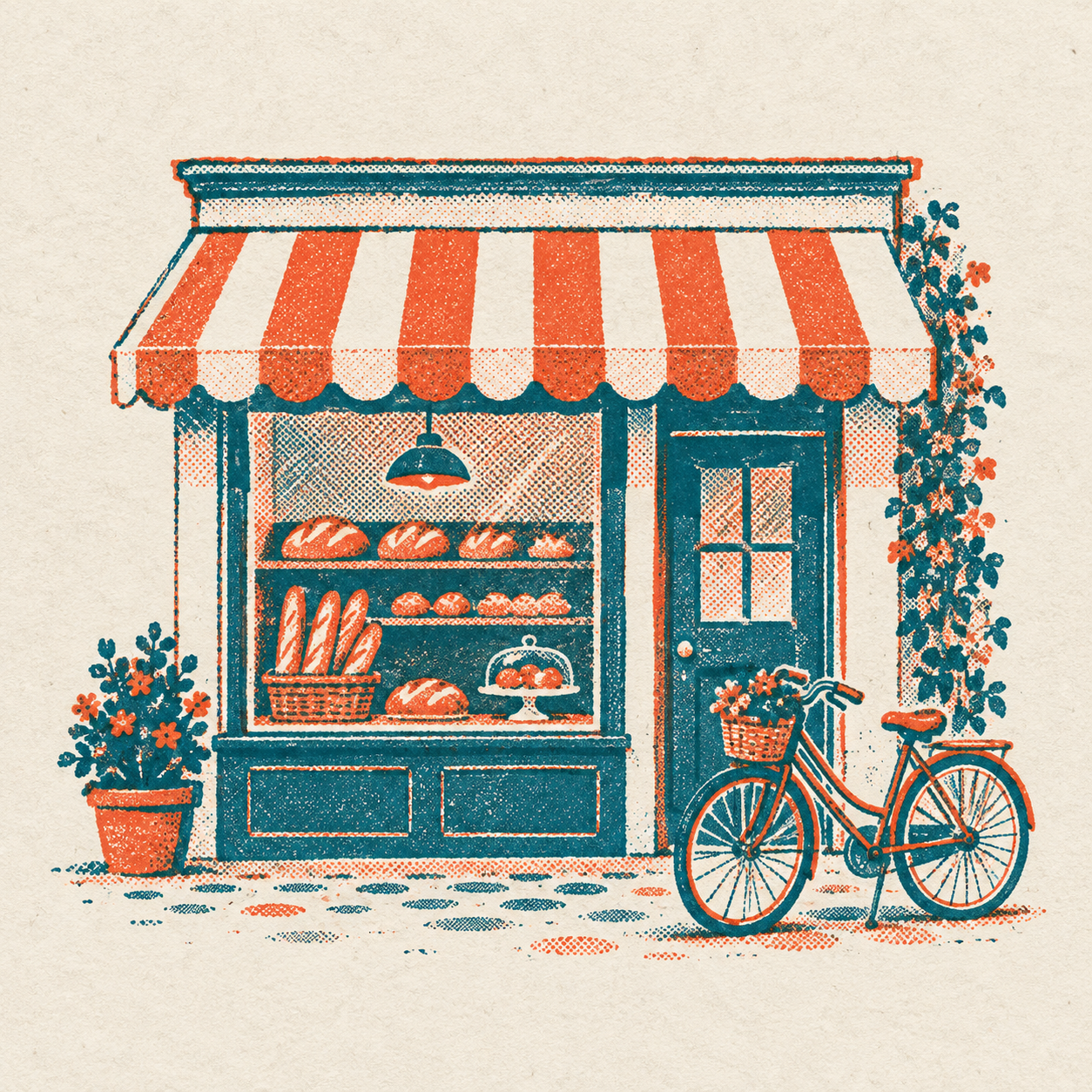 First test result: a bakery storefront from the same sentenceView original
What matched and what did not
Across all three, the teal and orange pair, the warm paper ground, the flat color shapes and the slightly off-register print feel survived. That is the part a style sentence locks in reliably, which also means you get it just by copying the sentence.
Other things we had written still came out differently from image to image. The halftone was coarse and obvious on the mug, but on the person it was mostly hidden behind a rough paper grain. The outline was a clear teal line on the mug and the bakery, while the person was built from color areas without a line. We never specified the aspect ratio, so we got two tall rectangles and one square, and the edge margin varied too. These gaps do not mean the style is weak. They appear because the sentence left some cells empty and the model filled them to suit each subject.
The cells a sentence leaves empty get filled by the model
Put the three first-round images side by side and you can read what the model changed per subject. A simple object like the mug has wide surfaces, so there was room to show large dots. The scene with a person has many details, so it filled in with fine texture instead of dots. The bakery has many straight edges, so outlines organized its shapes. Each choice is reasonable for that subject, yet if you treat the three as one brand's images, they look as if different print shops made them.
So when you write a style sentence, it pays to check where you left blanks before you count what you wrote. If you named the colors but not the line weight, or the ratio but not the margin, those blanks are exactly what will vary from scene to scene.
Pin down only what is left
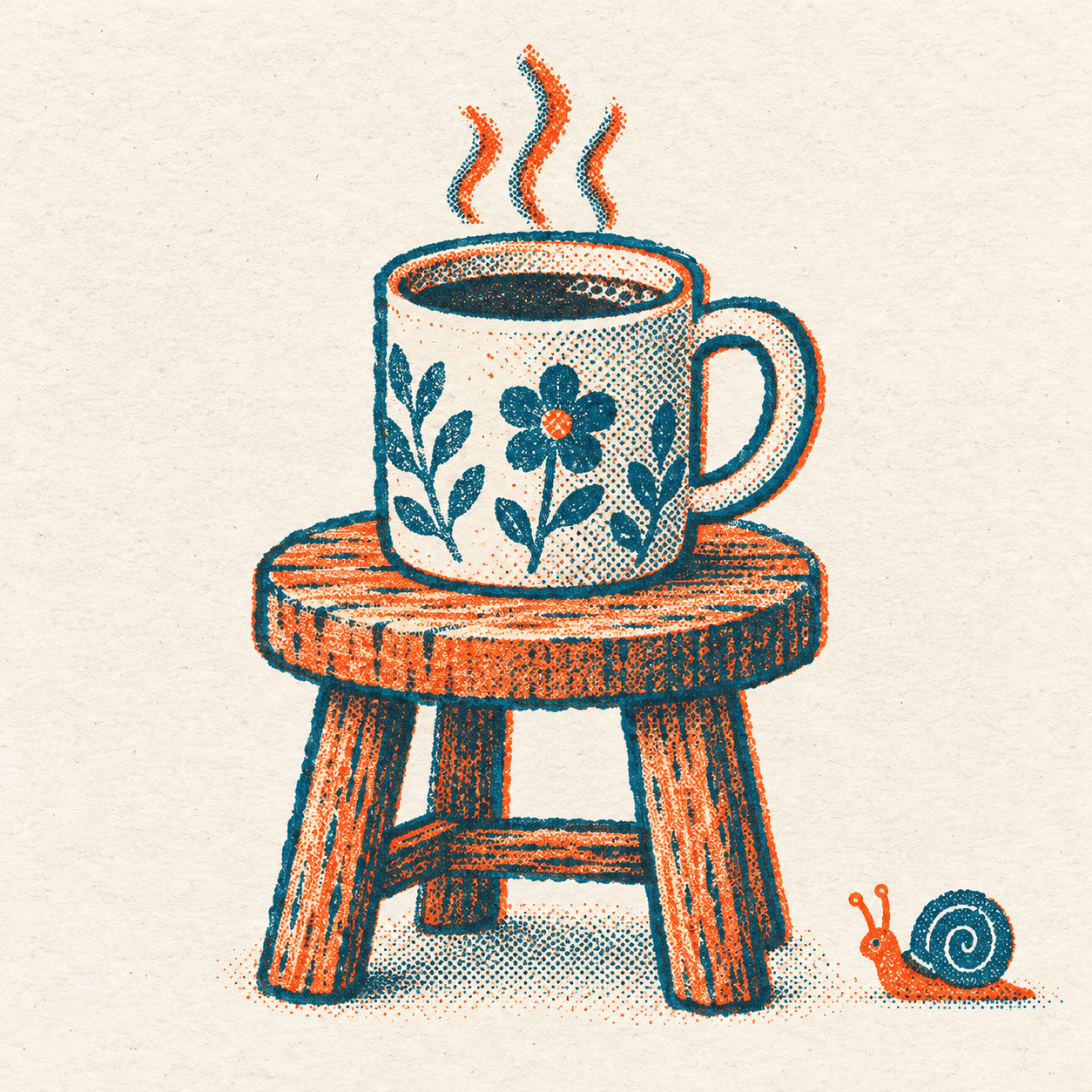
In the second test we fixed each drifting cell in words, one at a time. We asked for a square canvas, a margin of at least 8 percent, medium-size dots in every shaded area, and a thick rough ink outline on every main shape. As a stand-in for a brand-only element, we added a small snail in the lower right that always looks left. The exact input for the mug scene is below, and the person scene changes only the subject.
Two-ink risograph print look: only teal blue and warm orange-red inks on off-white uncoated paper. Square 1:1 canvas with at least 8 percent empty margin on every side. Medium-size visible halftone dots in every shaded area, slight misregistration between the two ink layers, rough paper grain, thick uneven ink outline around each main shape, no gradients, no text. Recurring element: one small orange snail with a teal spiral shell sits in the lower right corner, facing left, about one tenth of the image width. Subject: a ceramic coffee mug with steam on a small wooden stool.
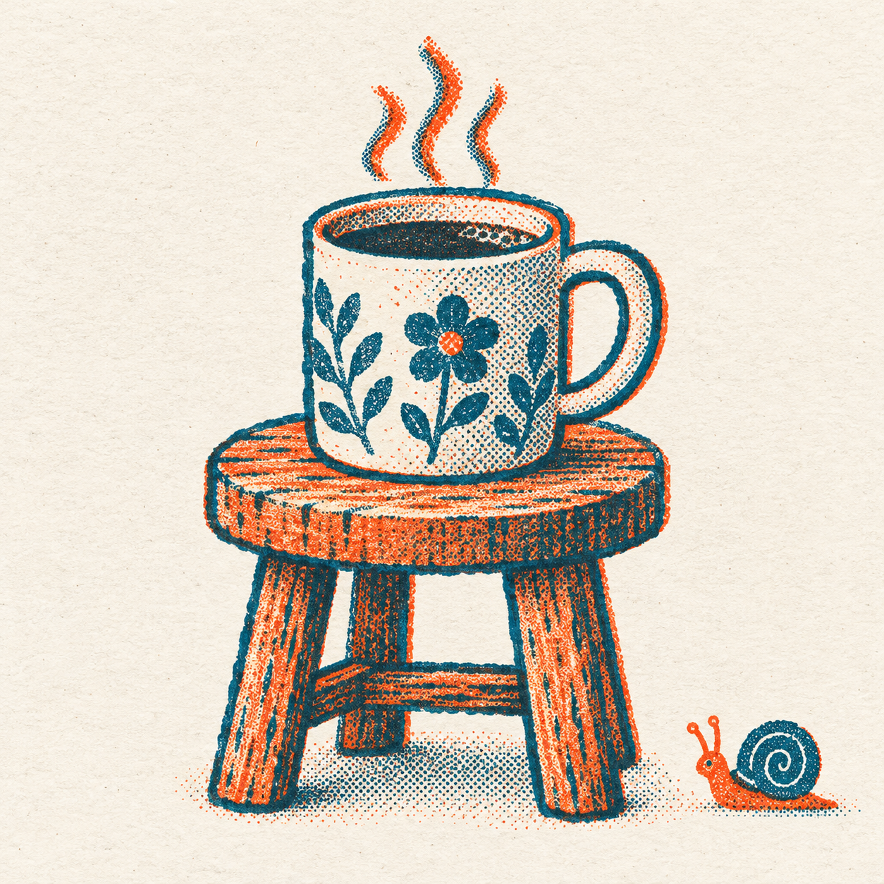 Second test: the same mug scene with a fixed outline and a snailView original
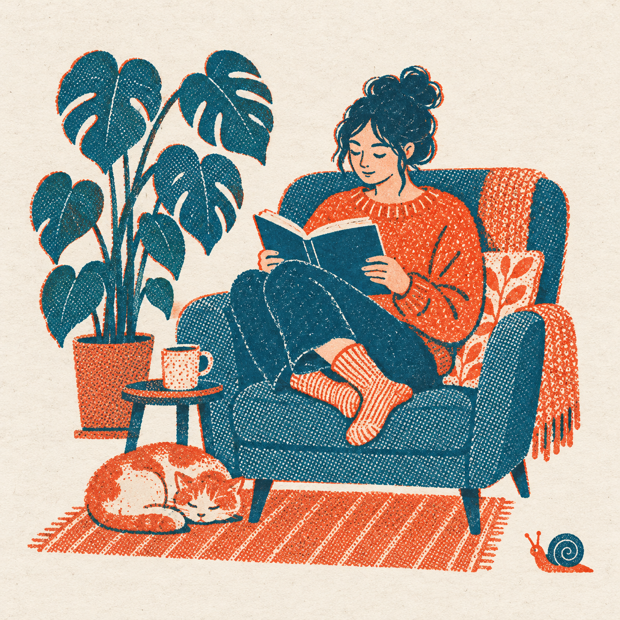 Second test: the reading scene with the same sentence appliedView original
Both images came out square, and the snail sat in the lower right looking left at a similar size. The teal outline carried through both, and the halftone showed at a visible size in both. The margin was not perfect, though: in the person scene the artwork comes fairly close to the edges, and in the mug scene the steam rises well into the top margin. Each scene was generated once, so we cannot promise the same sentence gives the same result every time.
A style sheet you can fill in
Bundle the cells the test exposed and you have a style sheet. The template below carries over the structure of that test. It is an unexecuted example, and we have no result from feeding this template itself into a generator. Its job is to put everything on one page so the next person does not have to guess.
[Brand name] style sheet
Fixed colors: [names of the two inks and how much of each]
Fixed texture: [paper type, halftone dot size, amount of misregistration]
Fixed line: [outline weight and roughness]
Fixed frame: [aspect ratio and edge margin]
Our own element: [the recurring character or object, with position, size and direction]
Text rule: [logo and copy are added over the art afterwards; no text inside the art]
Check subjects: [one product, one person, one space]
Color and texture were already stable in the first test, so a name and a ratio are enough there. The cells that drifted, namely line, ratio and margin, need numbers or concrete wording. A recurring element needs its position, size and facing direction written down; the snail landed in the same place facing the same way in both images because all three were in the sentence. The text rule holds a single line saying no text inside the art. Adding the logo and copy over the finished image afterwards avoids garbled lettering.
Adjusting it over time
Change one cell at a time. If the halftone is weak, adjust its size and where it applies. If the outline disappears, adjust the weight and what it surrounds. If the recurring element shows up in the wrong place, make the position and direction wording more specific. Change several at once and you cannot tell which change did the work.
A team starting out can begin with a short version that lists only the cells that drifted, not a long sheet. Once two or three cells keep drifting in your tests, pin those down with numbers and concrete wording and leave the rest to the basic style sentence; in this test, that was enough to hold things together.
Pick check subjects that differ in nature. Running a product, a scene with a person and a space together shows quickly where the style breaks. If we had only run the mug, we would have judged the outline and halftone fine, and it was the person scene that revealed two cells drifting.
OpenAI's image prompting guide likewise advises spelling out style, composition and constraints when you have a specific result in mind, and instructing any in-image text separately and exactly. The style sheet in this article is that advice condensed to one page for repeated use.
What a style sheet does not solve
A style sheet is a checklist for reducing drift, not a guarantee that one sentence gives one result. Small variations in margin or props from scene to scene, as in our second test, remain. You still need a review step: put finished images side by side, compare color, texture, line, margin and recurring element one by one, and fix only the cell that slipped.
Rights are the other limit. Every test image here was generated for this article, and we did not upload anyone else's images or characters. If you base commercial images on someone else's style reference or character, check its terms of use separately. For elements that already carry rights, such as a logo, do not leave them to generation; place the original file on top of the finished picture.
The order for checking a result
When a new image arrives, check ratio and margin first. Next, confirm the ink colors stayed at two. Then check that the halftone and outline match what the sheet says, and finally that the recurring element is in the stated position and direction. A fixed order cuts down on judging the same image by different standards each time.
One record is worth keeping. A single line per attempt, saying which cell you changed and what moved, shows which cells drift often so you can add them to the next sheet. The record from this test is short. In the first test, ratio, halftone and outline drifted. In the second, we fixed those three cells and the recurring element, and everything carried through in both images, though the margin was not fully identical.
Sources
Starting idea: ohneis652, public carousel post. Cross-checked guidance: OpenAI, image prompting guide. All test images and prompts were generated and written by DMS.Labs; the two English prompts are the actual inputs, and the sheet template is an unexecuted example.