A poster needs somewhere for the title to live. If the prompt describes an attractive subject but leaves the lettering to find its own place, a wing, shadow, or decorative detail may compete with the words. Before adding more mood adjectives, assign one area to the title and another to the subject.
For this example, the title belongs at the upper left and a blue folded-paper bird belongs at the lower right. In the one image generated, those areas did not overlap. The requested title, however, was PAPER / FLIGHT, and the slash was missing. Placement and exact copy need separate checks.
The source idea and the scope of this example
Jessica (@aistudio.jessica) describes six fashion-poster concepts combining poses, camera choices, and typography in the public caption of her September 18 Reel. The caption also says text colour and background can be specified. It offers private codes through comments, but no specific request keyword was verified in the public caption. We did not receive or reproduce those codes.
This article uses an inanimate paper bird rather than a fashion model. Its layout instructions and templates were written independently. They do not reproduce the creator's images, caption wording, or private prompts. These are ordinary natural-language requests, not an explanation of slash codes as native ChatGPT commands.
OpenAI's official image prompting guide advises naming element positions when layout matters. It also describes quoting literal text and specifying typography, colour, and placement, along with separating what should change from what should remain unchanged during edits. Those are prompting features, not evidence that our particular layout will work reliably. We make no performance claim from the guide.
The exact prompt used
The following text is the actual prompt used for the generated poster. It has not been revised after generation to match the result. The slash remains in the quoted title because it was part of the original request.
Create one original vertical 4:5 editorial poster image demonstrating deliberate separation of subject and typography. A sculptural cobalt-blue folded-paper bird rests on a pale limestone plinth in the lower right half of a warm off-white studio background, lit by gentle window light. The entire upper left half is clean negative space. Place only the exact English title "PAPER / FLIGHT" in two lines in the upper left, using elegant black modern sans-serif typography. Keep a clear margin between letters and the bird. No people, brands, logos, other words or watermark. Restrained premium design, subtle tactile paper and stone textures, crisp type. This is an original conceptual example, not a reproduction of any artist image.
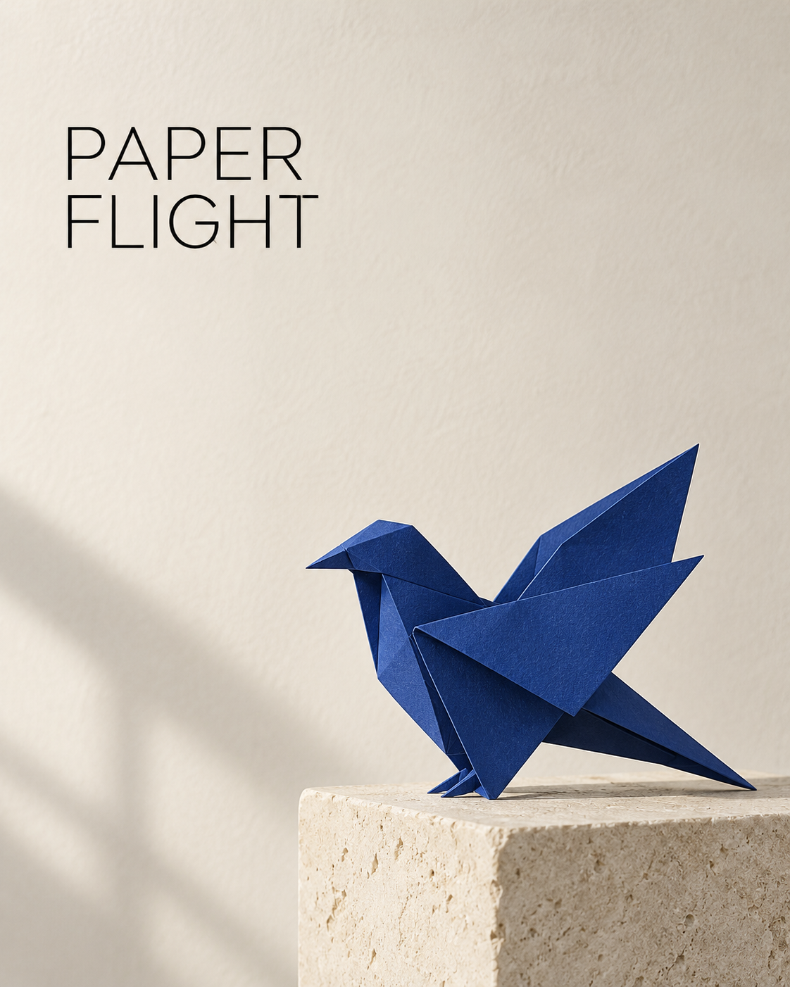 The generated poster has PAPER above FLIGHT at the upper left and a blue folded-paper bird on a stone plinth at the lower right. The requested slash is absent.View original
Pixel inspection of the actual output showed PAPER above FLIGHT at the upper left. A blue paper bird rested on a stone support at the lower right. The lettering and bird did not overlap, and there was visible space between them.
The text requirement was not fully met. Although the requested two-line arrangement appeared, the / did not. That is a punctuation error, not an exact rendering of the requested title. We have no evidence establishing why it was omitted, so it would be misleading to blame the line-break instruction or any particular phrase in the prompt.
This was one actual trial. There was no version without zoning instructions and no repeated run under the same conditions. It does not establish an improvement rate, prove that zoning caused the observed layout, or predict results for another title. The observation is limited to this image's placement, separation, and missing character.
Make five decisions before writing the prompt
A rough sketch with two boxes is enough to start. Draw one box for the title and another for the subject. If they overlap on paper, decide whether to move the title, reduce the subject, or change the canvas. That decision is easier to explain than a general request to make the poster look more balanced.
Start with the canvas. The actual prompt requested a vertical 4:5 composition. That is a composition instruction; it does not replace checking the exported file's dimensions. If the destination is a wide banner, plan a banner layout rather than assuming a crop will preserve the poster. The words and subject can be correctly separated in the original while a later crop removes a letter or wing tip.
Next, settle the copy and its line breaks. Two short words and a paragraph cannot occupy the same title box. Confirm the title before generation, and distinguish it from information that cannot be omitted, such as a date, venue, or price. Even the short English title here lost punctuation, so brevity is not a reason to skip proofreading.
Describe the subject's region with its supporting elements included. “A bird on the right” leaves more open than “a paper bird on a stone plinth in the lower right half.” The support and shadow also use space. A bird can be clear of the title while the plinth or a long shadow reaches behind the lettering.
Then define the background behind the words. Negative space does not merely mean an absence of objects. A dark window shadow or strong texture can make an otherwise empty area hard to read. This prompt pairs black lettering with a warm off-white background. With another palette, specify the lightness and texture of the title region instead of relying only on a background colour name.
Finally, define the relationship between the zones. Asking for a clear gap expresses a visual relationship. Asking for an exact pixel gap should not be treated as proof that generation will follow a measured layout. If a minimum margin is a production requirement, set and measure it with guides in a layout editor.
A reusable structure, not a tested recipe
The following is a self-authored, unexecuted layout example (미실행 구성 예시). It was not used to produce the image above, and it is not a promise of the same result. Replace the variables, then check whether the instructions contradict one another.
Create an original [canvas ratio] poster. Place [one inanimate subject, material, support] within [subject region]. Reserve [title region] as clean negative space with [background colour and texture]. Include only the exact title "[title]", arranged in [line count and line break], in [type style and colour]. Keep the subject, its support, and its shadow away from the title region. Leave clear separation between the title and the subject. Use [lighting]. No extra words, people, logos, brands, or watermark.
Choose the canvas ratio from the intended destination. In the subject variable, name the object, its material, and any support. Make the title region and subject region distinct. Do not later add “large and centred” if that conflicts with the earlier placement.
Use the title variable for final copy, not a rough suggestion. Specify where the line break should fall if it matters. Type style can describe a direction such as black modern sans-serif lettering. If a particular licensed font is required, do not substitute a generated resemblance and call it the same font. Use the actual font in an editor after checking its permitted uses.
Lighting needs its own spatial check. Window light may suit the paper texture but cast a shadow into the text area. Describe the part of the background that must remain simple. A long stack of adjectives is less useful for inspection than a clear condition such as keeping strong shadows away from the lettering. The effectiveness of this template itself has not been tested.
Check copy separately from composition
First, view the poster at a small size. Can you distinguish the title from the object without zooming? Then inspect the original image at a larger size and compare the text against the approved copy, character by character. Do not proofread from memory. For PAPER / FLIGHT, check capitals, word order, and the slash as well as the two words.
For composition, look for anything that enters the title area: a wing tip, support edge, shadow, or stray line. Elements need not touch to compete. A narrow gap can disappear perceptually when the image becomes a small card. Check the size people will actually see as well as the full-resolution file.
Whitespace has two jobs here. Inside the title box, it provides a readable background. Outside it, the gap separates the words from the subject. Also inspect the top and left edges. A layout may appear comfortably spaced before a platform crop or print trim removes some of that room. Set final margins for the destination rather than assuming the generated composition includes them.
Record the failed condition in concrete terms. “The slash is missing,” “the plinth shadow crosses behind FLIGHT,” or “the first letter is too close to the left edge” gives the next step a target. “The design feels wrong” does not tell you whether to adjust copy, background, scale, or position.
Edit one problem while naming what must stay
Both requests below are self-authored, unexecuted layout examples (미실행 구성 예시). They were not applied to this poster, and there is no verified improvement result from them.
Keep the bird, stone plinth, background colour, and lighting unchanged. Change only the title region: move the lettering farther from the bird and retain clean space behind every letter. Do not add any words.
Keep the composition and subject unchanged. The required title is exactly "PAPER / FLIGHT", including the slash. Correct only the lettering. Do not replace or omit punctuation and do not add text.
The first targets a spatial conflict. The second targets incorrect copy. If the only failure is punctuation, there is no need to redesign the bird's material or lighting. If a shadow makes the title unreadable, shrinking the letters may not address the background problem.
Inspect previously correct elements again after any edit. The subject shape or line arrangement may have changed. “Keep everything else unchanged” is a request, not a substitute for checking the result. Decide when to stop requesting image edits and place editable text in a layout tool instead.
When exact wording is a requirement
Event names, dates, prices, contact details, and required notices should not depend solely on lettering embedded in a generated image. A practical route is to prepare a subject-and-background image without text, then add the approved copy as a separate text layer. Reserving a title zone still matters because it gives that layer a suitable background.
In the layout editor, set the actual canvas size and guides before placing the title. Check font permissions, line breaks, spacing, and edge margins. Compare the text layer with the approved wording. After export, check for clipping and contrast again. Correct text in the editor is not enough if the final file cuts off its first letter or makes it unreadable against the background.
For this particular output, do not pass the slash-free image off as a completed exact-title poster. Changing the approved title to two words without punctuation is a copy decision that needs to be made explicitly. If the original title is retained, the missing slash requires correction. Do not quietly reinterpret an omission as a design choice.
The second image is an illustration, not a comparison test
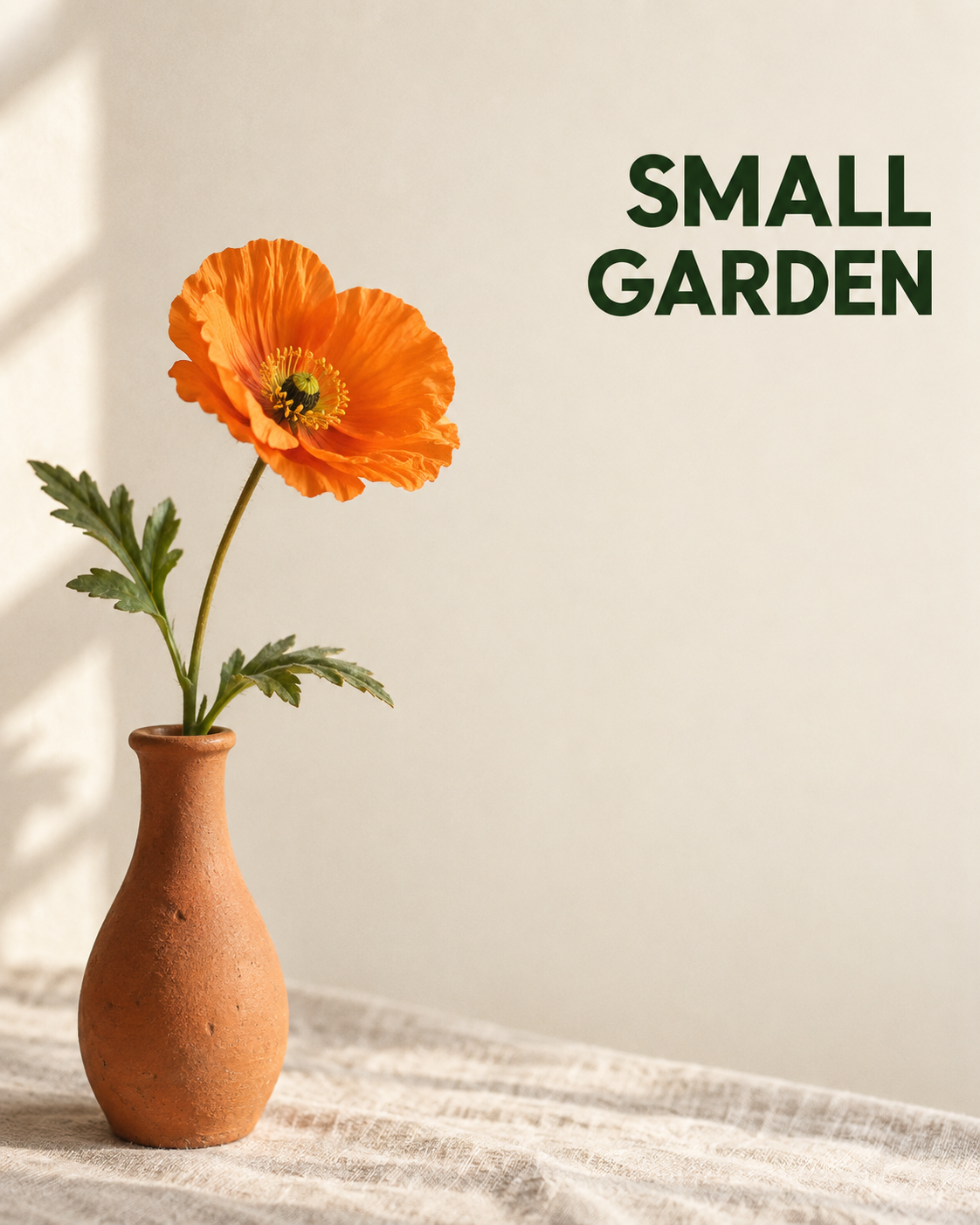 A separate illustration for thinking about title and subject zones. It is not a repeated trial under the first image's conditions.View original
This second image serves as a separate illustration of layout planning. It is not a rerun of the first prompt under the same conditions, and the pair should not be used to calculate a performance difference. This article makes no claim that the second image's detailed subject or lettering accuracy was verified.
For another layout, decide whether the title needs a wide area across the top or a narrower area down one side. A longer title may need width more than height. Consider the object's silhouette too. A wing extending sideways can cross a narrow subject zone, so changing its scale or orientation may be part of the layout decision rather than a decorative afterthought.
Rights and publication checks
An independently conceived paper bird does not automatically settle every right involved in a final poster. Check the image service's terms and the permitted uses of any font you apply. If you add reference images, confirm that you have permission to upload them and use them in the intended workflow.
This example is not a method for copying the source creator's photographs or obtaining private codes. Do not add another artist's work or a brand mark in a way that confuses authorship or endorsement. For commercial use, check relevant disclosure and platform requirements, and keep generated concepts distinct from factual product or event information. A conceptual paper-bird image should not be presented as a photograph of a real product or an actual exhibition record.
Finish with two separate decisions: are the title and subject in their assigned regions, and does every character match the approved copy? In this single output, the observed layout supported the first check, while the missing slash failed the second. That distinction tells you whether the next task is a composition change or text editing.