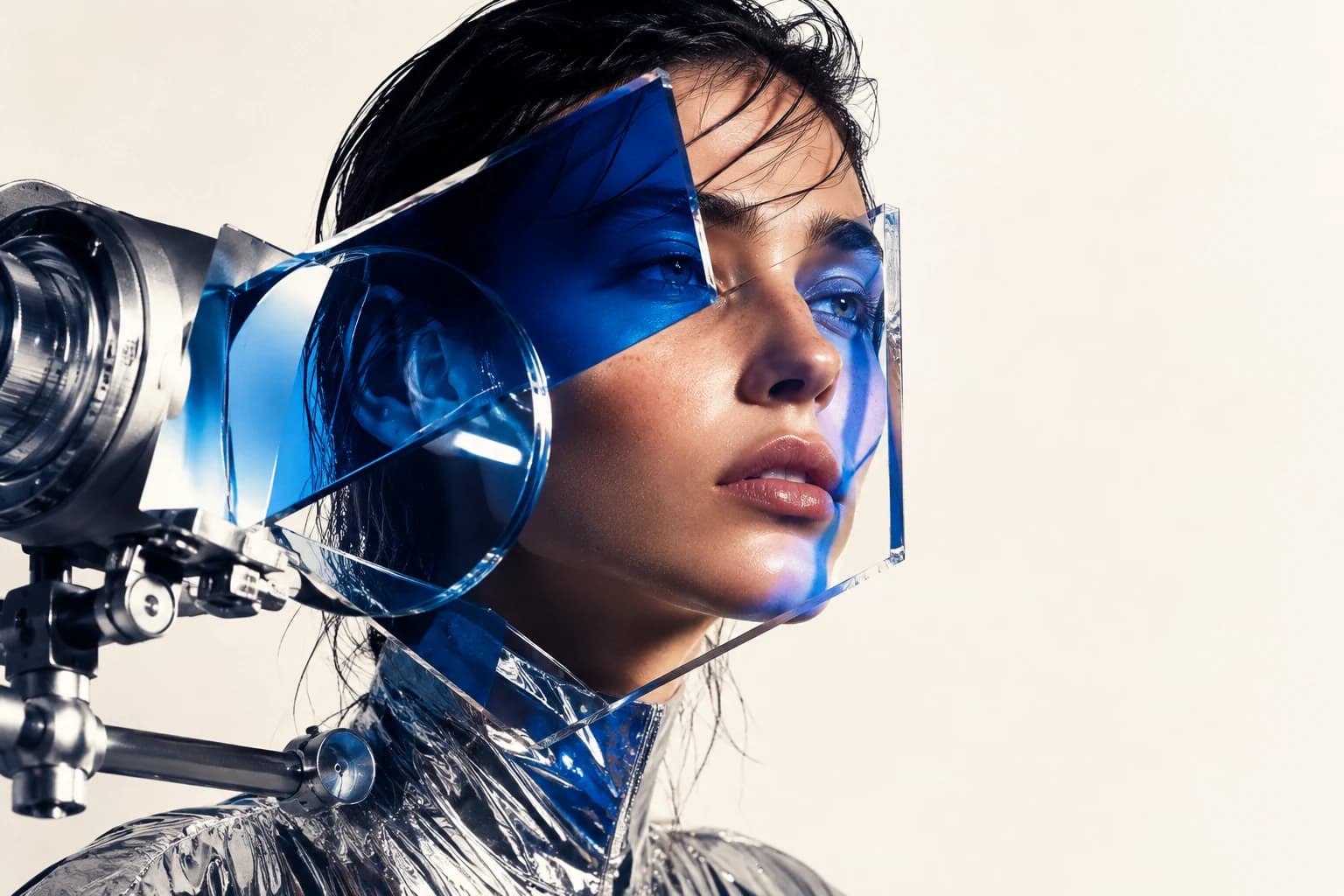
This article builds on a piece I found on Medium, which I tested myself and reorganized.
What I have learned from using Midjourney is that establishing a stylistic direction matters far more than the prompt itself.
Even with the same subject matter, changing a single style keyword can produce an entirely different image. At first, I simply tried a bit of everything. Eventually, I began to sense, "If I take this direction, this is the kind of result I can expect."
Then, not long ago, some unexpected news arrived. Midjourney v8 Alpha was unveiled on March 17, 2026.
It is still accessible only through alpha.midjourney.com, but the changes feel substantial. I have also put together an overview of what is different in v8.
Today I am introducing four styles: editorial, artistic portraiture, flash realism and dark cinematic. Each serves a different purpose and creates a completely different atmosphere.
Midjourney v8 Alpha — What to Know First
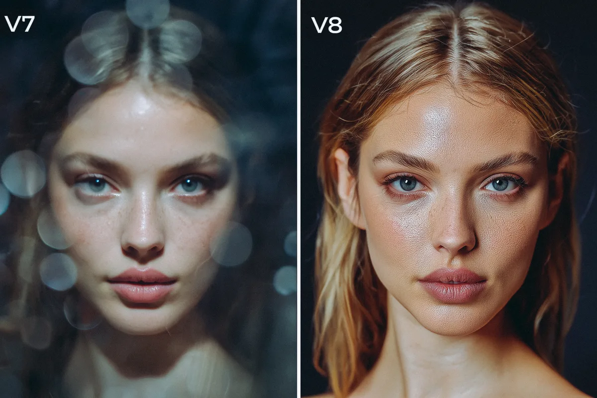 Midjourney v8 versus v7 comparisonView original
Before introducing the styles, I should talk about v8. This is more than a routine upgrade: v8 is a completely rebuilt model.
Three Key Changes in v8
1. Speed — Five Times Faster Than v7
Generation that used to take 30–60 seconds now takes less than 10. That changes the workflow more than you might expect. Experimenting with different ideas becomes much easier.
2. Native 2K Resolution (the --hd Parameter)
Adding --hd generates an image at 2048×2048 from the start, without upscaling. Previously, details could blur or distort during upscaling; that problem is now gone. Bear in mind, however, that GPU costs are four times higher.
3. A Much More Literal Understanding of Prompts
Where v7 "interpreted" a prompt, v8 "reads it literally." Specific, detailed descriptions work better than short, evocative prompts. I have made the style prompts below more specific with v8 in mind.
New Parameters in v8
--hd
Native 2K rendering
2048×2048 output without upscaling
⚠ Four times the GPU cost
--q 4
Improved consistency in complex scenes
Effective for compositions with many layers
⚠ Four times the GPU cost
--sv 7
v8-compatible style references
Four times faster and cheaper than the previous sref
✓ Can be combined with --hd
--raw
Removes the default v8 styling
Neutral, predictable results
✓ Strongly recommended for portraits
Caution: Using
--hdand--sreftogether causes a conflict. At the current Alpha stage, use one or the other.
When v7 Is Better, and When v8 Is Better
Community reactions are divided.
- v7 is better: For artistic, emotional work, atmospheric photography, or when you want an "AI-style interpretation"
- v8 is better: For commercial photography, product visuals, accurate text placement, or native high resolution
I have organized the style prompts below into versions suited to both.
Style 1. Color Editorial — A Useful Style for Brands and Advertising
 Color editorial style sampleView original
This style combines rich colors with crisp detail. It is especially well suited to product visuals and brand imagery. Deep dark tones replace pure black, leaving a slight analog film feel.
What I like about this style is that the results are ready to use. They tend to look polished enough to fit naturally into a social media feed.
Celestial figure / Flash-lit editorial aesthetic / Candid documentary feel /
Overhead and cropped framing / Raw unpolished realism /
Direct on-camera flash with hard reflections / High-contrast lighting /
Tactile surface detail and texture / Glassy highlights and specular accents /
Asymmetrical layout / Snapshot storytelling energy /
Stark whites / Muted rose pinks / Deep wine reds /
Soft strawberry tones / Creamy ivory shadows
-- exp 25 -- quality 2 -- raw -- stylize 250
Tip for v8: Be sure to keep --raw. The default v8 processing can exaggerate the editorial feel. A --stylize value between 150 and 250 works well.
When should you use it? Product photography, beauty brand content, and images with a fashion editorial feel. Its distinct colors also work well in social media feeds.
Style 2. Artistic Portraiture — An Emotional, Painterly Atmosphere
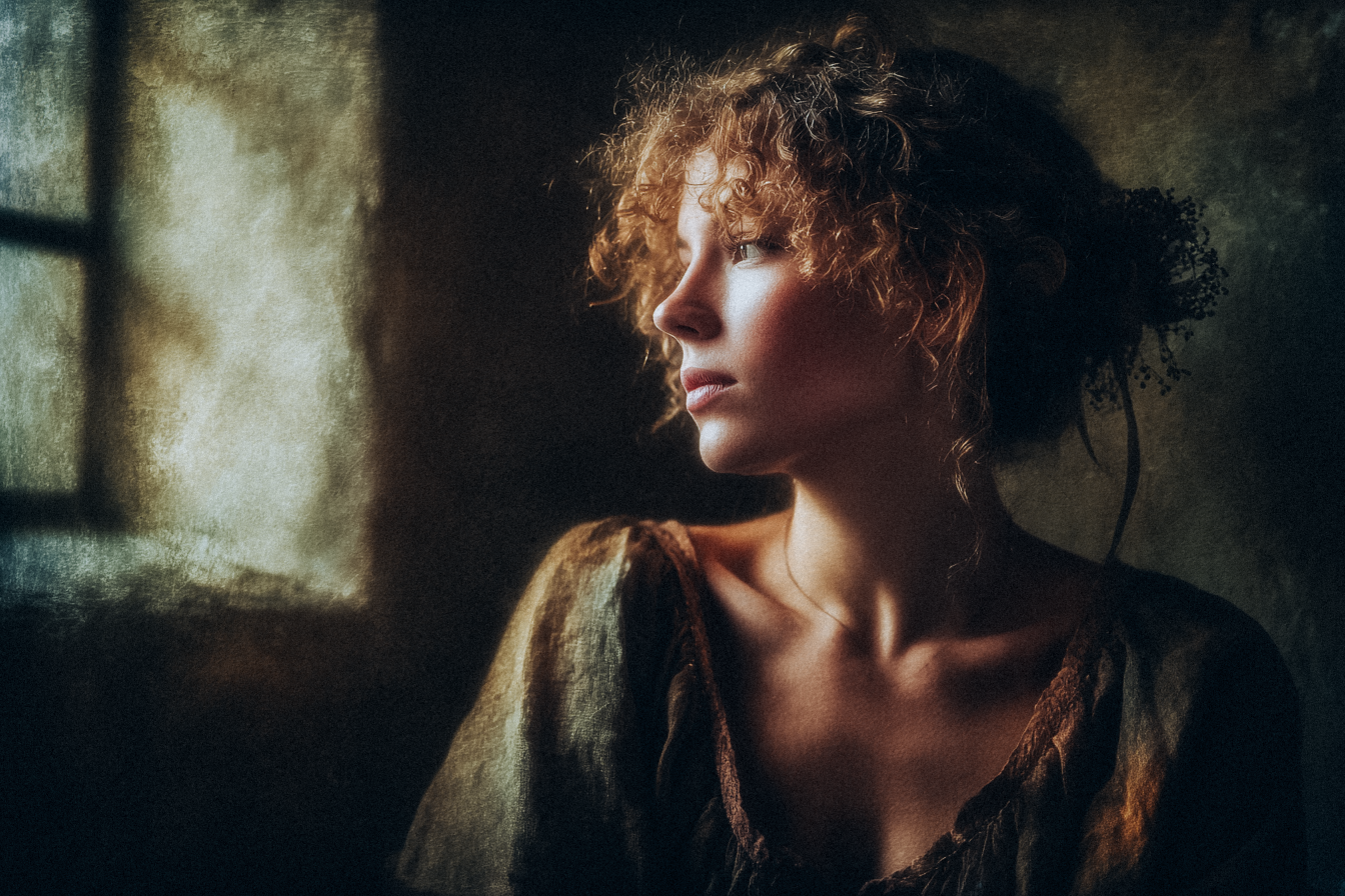 Artistic portrait style sampleView original
This style brings together strong contrasts of light and shadow, natural lighting and floral elements. It feels closer to painting than photography. It works well for creative portraits and art projects.
Honestly, I think v7 expresses this style better. Because v8 reads the prompt so "accurately," it tends to reduce the painterly atmosphere. If you want to use v8, try raising --stylize to 400–500.
Fine art portrait of a woman in contemplative pose,
bathed in soft filtered light through an aged latticed window.
Distant gaze with a thoughtful expression.
Wearing a raw linen dress, dried flowers subtly braided into her hair.
Old stone room with textured plaster walls showing layers of time.
Gentle diffused highlights and velvety chiaroscuro shadows.
Shot on medium format analog film, visible grain, vintage lens aesthetic.
Shallow depth of field, background dissolves into muted ochres and soft greens.
Poetic realism, intimate and melancholic atmosphere
-- ar 2:3 -- raw -- stylize 350
Tip for v8: Adding --hd makes individual hairs and dried flower petals much sharper. That extra sharpness can reduce the painterly feel, though, so try it with --stylize 400.
When should you use it? Artistic portrait series, book covers and emotionally evocative brand images. It particularly shines in personal creative projects rather than client work.
Style 3. Flash Realism — The Clarity of a Fashion Editorial
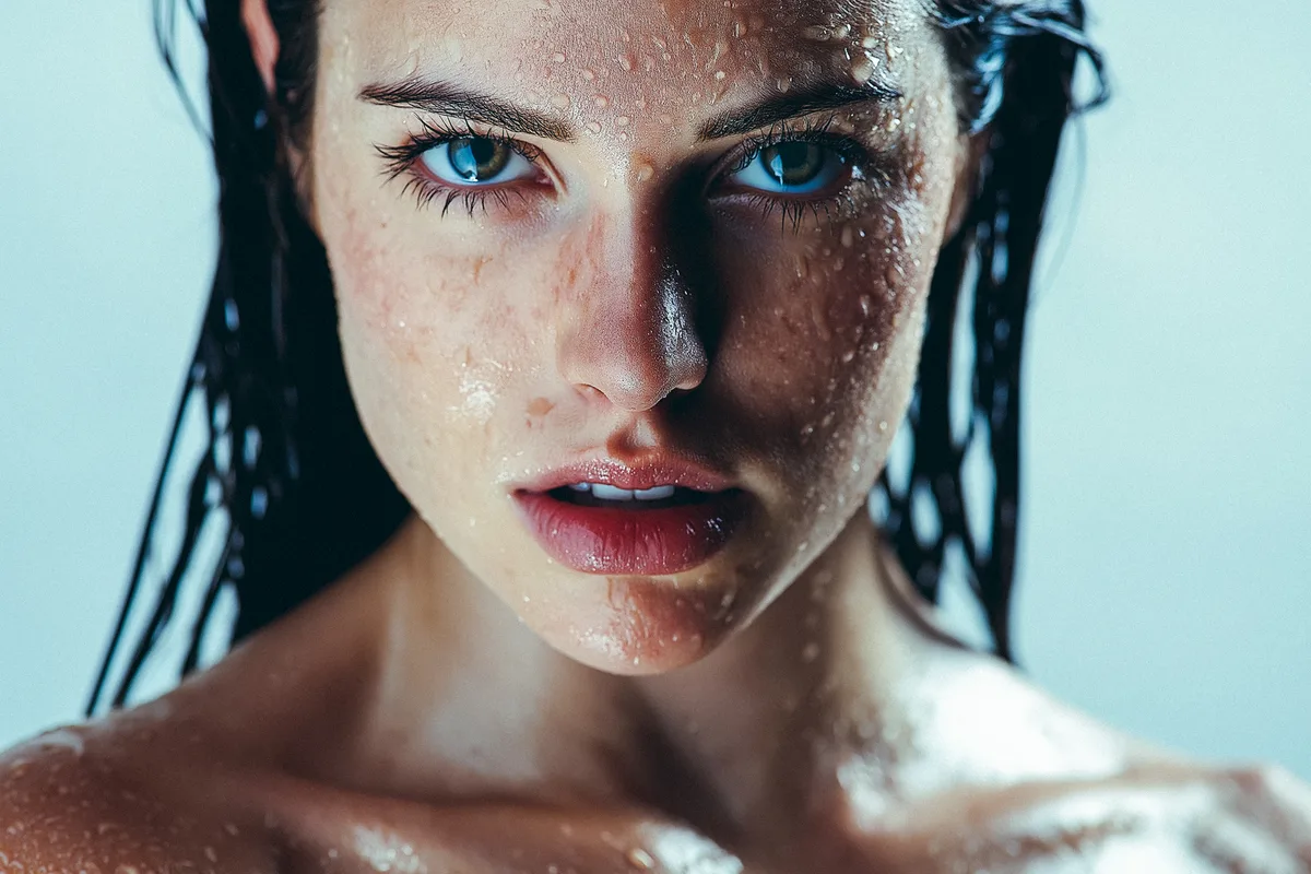 Flash realism style sampleView original
This style uses flash lighting and a neutral background to create the intensity of fashion photography. Wet skin and hair textures add impact. It is ideal for product visuals and bold brand imagery.
This is the style that improved most in v8. Native 2K resolution makes skin texture, water droplets and individual strands of hair much sharper. Some still consider Flux 2 slightly ahead in skin realism, but v8 leads in overall finish.
Editorial portrait, woman with wet dark hair,
intense direct gaze into camera.
Water droplets glistening on skin and individual hair strands.
Single softbox positioned 45 degrees to the left,
strong shadow across the right side of the face.
Clean studio background, shallow depth of field.
Ultra-detailed skin texture with visible pores.
Shot on 85mm f/1.8 prime lens, 8k resolution
-- raw -- stylize 150 -- hd
Tip for v8: --hd makes the biggest difference here. Skin pores, eyelashes and individual droplets become clearly distinguishable. The key is keeping --stylize 50~150 low.
When should you use it? Beauty product advertising, haircare brands and cover images that need a strong first impression. Of these four styles, it produces the most immediately usable commercial results.
Style 4. Dark Cinematic — An Intense Mood and Dramatic Contrast
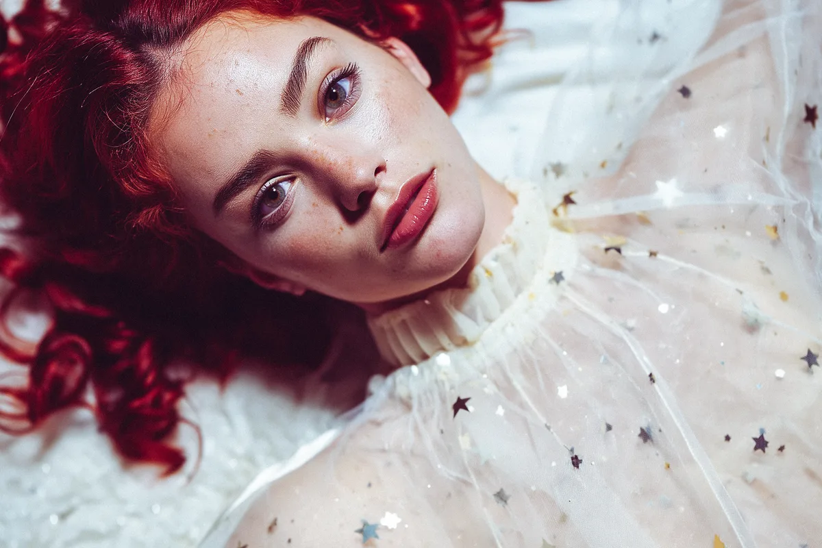
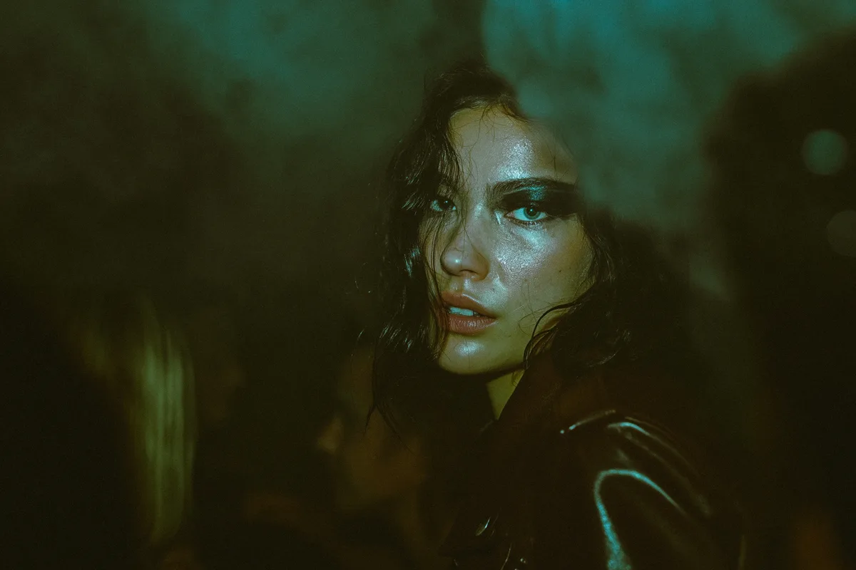 Dark cinematic style sampleView original
Deep green tones dominate this style, with strong contrast between black and skin tones. It expresses a cinematic mood and a dramatic atmosphere at the same time.
This style produced particularly strong results in v7 when I linked a color reference with --sref. Since v8 does not allow --sref to be combined with --hd, I recommend v7 at this stage.
Portrait in a dark underground techno venue.
A woman with an intense gaze, wearing a dark leather jacket and bold eye makeup.
Direct camera flash cuts through dense smoke machine haze.
High contrast lighting — deep cool shadows with muted green undertones.
Grainy film texture, dramatic cinematic atmosphere.
Sweat on brow, motion blur on background crowd.
Raw underground energy
-- ar 2:3 -- raw -- stylize 450
Tip for v8: If you use v8, try adding --q 4. It increases the layered complexity of smoke and mesh fabric for a much richer feel. The cost does rise fourfold, however.
When should you use it? Music artist promotion, nightlife branding and fashion editorials that call for a dark mood. Its strong impact suits posters and album covers.
The Four Styles at a Glance
Color Editorial
Rich colors, an analog film feel
→ Brands, products, social media content
Suitable for both v7 and v8
Artistic Portraiture
Painterly, emotional natural light
→ Creative projects, book covers
v7 recommended
Flash Realism
Crisp, commercial intensity
→ Beauty ads, cover images
v8 + --hd recommended
Dark Cinematic
Intense mood, dramatic contrast
→ Music promotion, posters
v7 recommended (using sref)
General Tips for Portraits in v8
Here are the areas where the approach differs from v7.
1. Describe the Lighting Physically
v8 executes prompts literally. Instead of an abstract phrase such as "cinematic lighting," use the language of a photo shoot: "a softbox coming from 45 degrees to the left, with a strong shadow on the right side of the face." The results are much more accurate.
2. Lower the --stylize Value
v8 has stronger default photorealism than v7. --stylize 50~150 is appropriate for portraits. Raising it can actually make the result feel artificial.
3. Always Keep --raw
The default v8 processing tends to exaggerate colors. Adding --raw produces more natural, predictable results.
4. Use --hd Alone for High-Resolution Work
Combining --hd and --sref causes a conflict in the current Alpha version. If you need high resolution, work without --sref; if you need a style reference, work without --hd.
Closing Thoughts
After trying both v7 and v8, I found that they serve different purposes.
Choose v7 for emotion and atmosphere, and v8 for clarity and precision. Using both models according to the situation seems to be the best approach for now.
Pick one of the four styles above and try it straight away. Even a single --hd line can make a substantial difference.